Tamata Reo | Self-Initiated Project
Aotearoa New Zealand
Overview
Tamata Reo emerges as a quiet act of design-led language reclamation—an exploration into how visual language can hold space for te reo Māori beyond instruction, and into lived, everyday presence. At its core, the project is a collection of custom glyphs developed as an educational visual system. Each form sits between symbol and story, inviting engagement through curiosity rather than correction—opening a more intuitive relationship with language through contemporary design.
Grounded in kaupapa Māori, the work reflects a commitment to normalising and uplifting te reo Māori within modern visual culture. It considers design not as surface treatment, but as a vessel for cultural continuity—where language can be seen, felt, and encountered in ways that are accessible, generous, and enduring.
Challenge
The project developed a system of custom glyphs as a visual language inspired by te reo Māori concepts and phonetics. Rather than functioning as literal translation, each glyph operates as a symbolic bridge—holding meaning through form, rhythm, and visual metaphor. The design approach was grounded in reduction and intention. Forms were simplified to their essential visual language, allowing space for interpretation while maintaining clarity and consistency across the system.
Kaupapa Māori principles guided the process throughout, ensuring the work remained anchored in respect, cultural integrity, and purpose. The glyphs were not treated as decorative icons, but as carriers of language—each one considered as part of a wider cultural conversation.
Approach
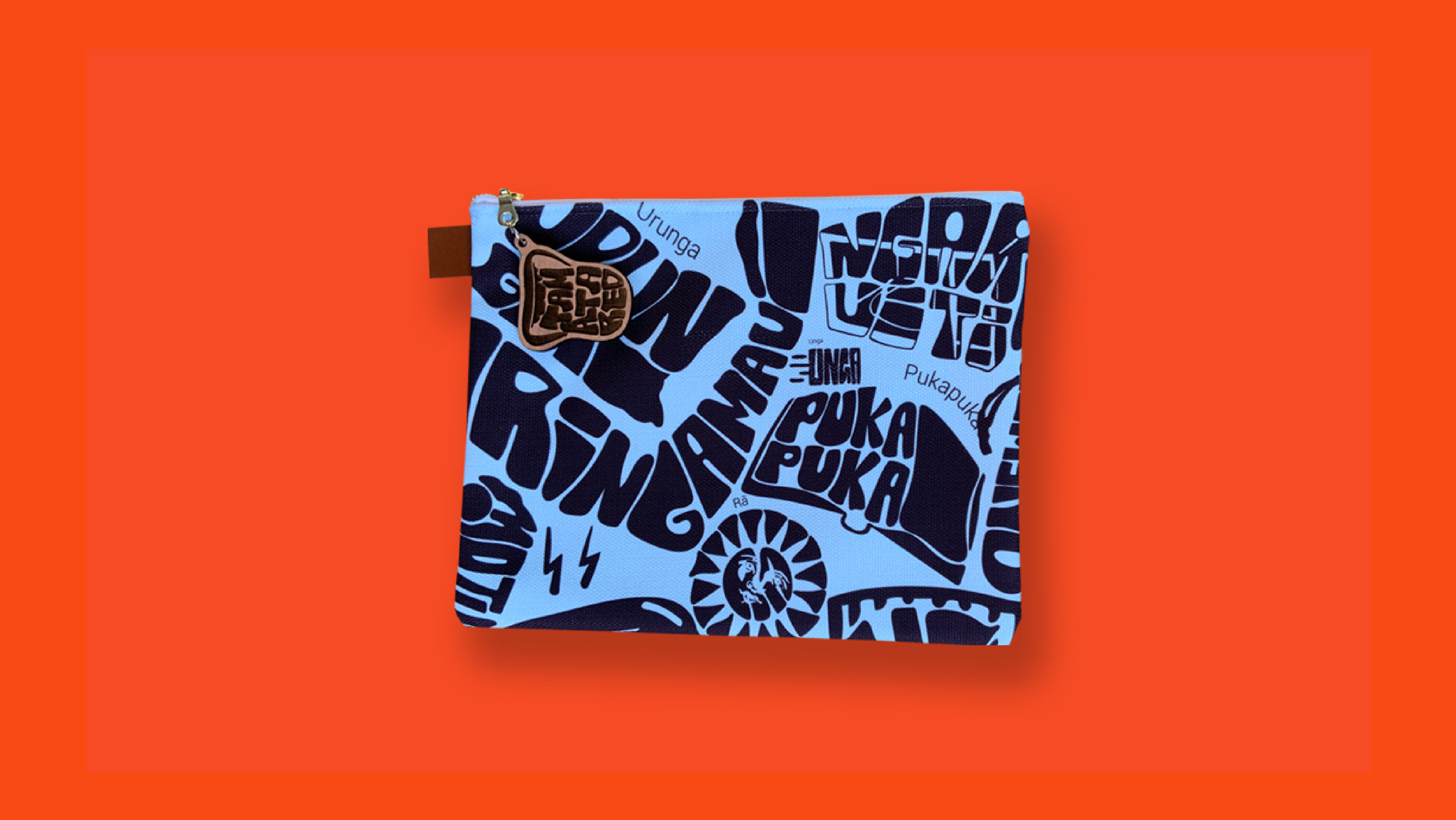
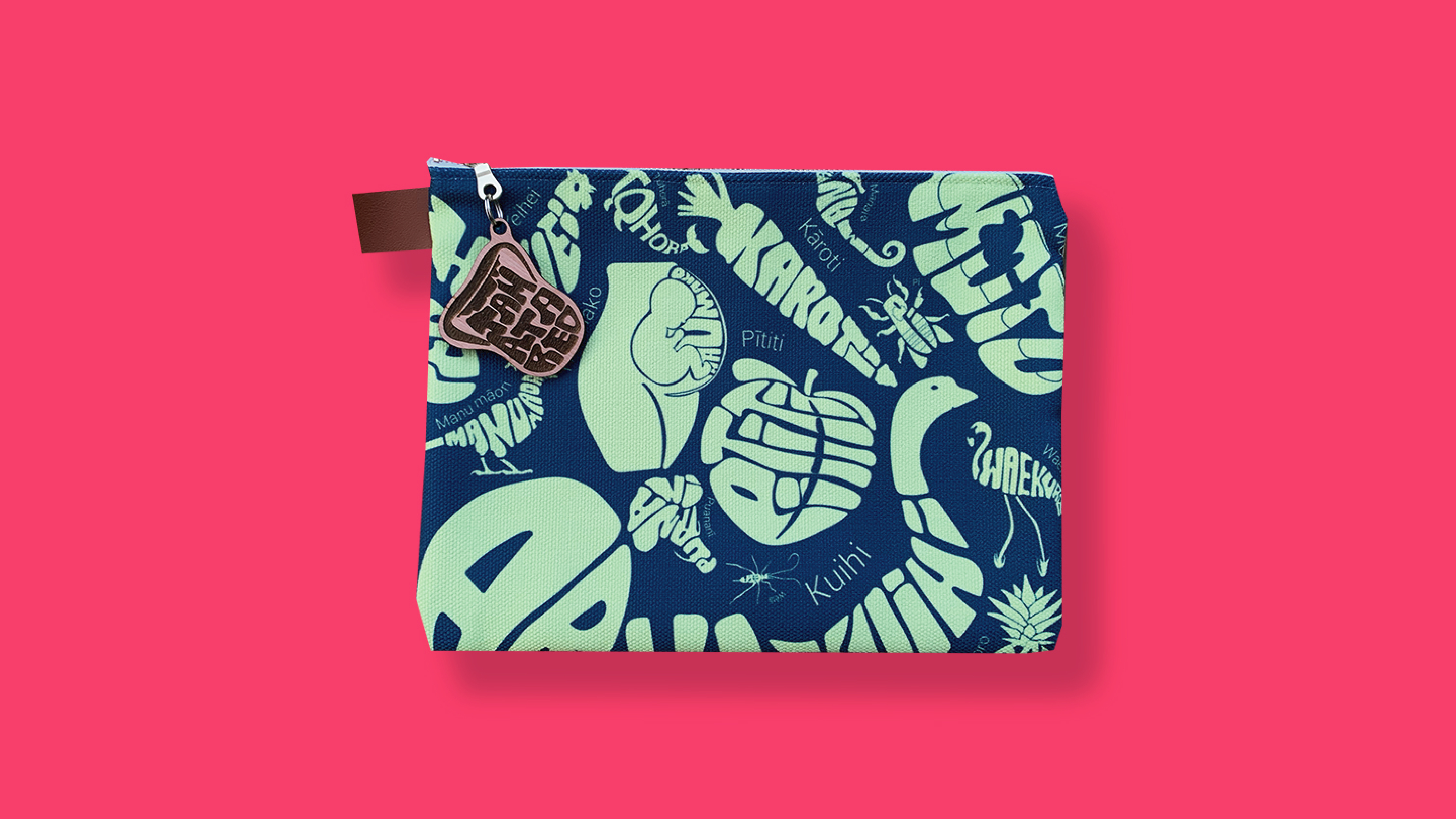
The project developed a system of custom glyphs that interpret elements of te reo Māori through simplified, symbolic forms. Rather than direct translation, each glyph acts as a visual anchor—encouraging recognition and personal connection over time. These glyphs were then applied to a series of fabric pencil cases, designed as functional, tactile objects that move with the user. The choice of a pencil case was intentional: an object associated with learning, but used in informal, everyday contexts.
Materiality played a key role. The softness of fabric, the repetition of pattern, and the intimacy of scale allow the language to be encountered through touch and routine. The object becomes both practical and communicative—holding tools, while also carrying language.
Application
As merchandise, the pencil cases operate as quiet forms of distribution—extending the reach of the glyph system beyond static design outcomes. They are designed to exist within schools, homes, studios, and shared spaces, where they can be seen, used, and revisited over time. In this way, they function as both marketing objects and educational prompts—sparking curiosity, conversation, and gradual familiarity with te reo Māori. The portability of the object allows the language to travel, embedding itself within different environments and communities. Each interaction becomes small but cumulative—building recognition through repeated exposure.
Outcome
Tamata Reo demonstrates how design can support language revitalisation not only through formal tools, but through objects that live alongside us. The pencil cases act as carriers of language—subtle, functional, and present. They shift te reo Māori from something that is occasionally accessed, to something that is consistently encountered. Through this work, language becomes part of the everyday landscape—held in the hands, placed on desks, moved between spaces. Not separate from life, but woven into it.
Branding
Brand Collateral
Print
Merchandise
Typography